


How Two-Tone Cabinets Became the Defining Look of the Modern American Kitchen
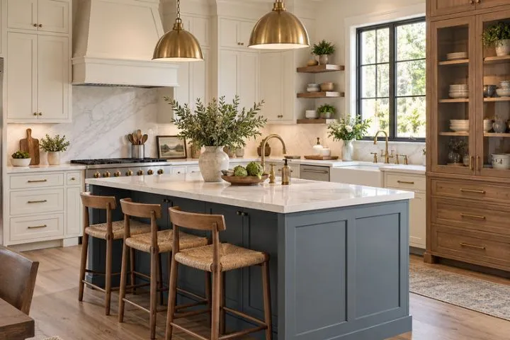
The modern American kitchen changed when the island stopped matching the cabinets along the walls. A navy, forest-green, or charcoal center introduced contrast while the perimeter remained bright and familiar. One deliberate color break gave the room a focal point without turning every cabinet into a statement.
As homeowners embraced that contrast, kitchen cabinet colors took on jobs beyond setting a backdrop. A second finish could ground an island, lighten upper cabinetry, echo nearby furniture, or connect the kitchen with an open living area. Two-tone cabinetry grew from a cautious accent into a flexible design language shaped by architecture, materials, and personal taste.
Each Cabinet Finish Has a Visual Role
A well-planned two-tone kitchen assigns each finish a clear purpose within the room. One may carry light and openness, while the other adds weight, warmth, or definition around a particular zone. That visual relationship helps explain how the style became widely recognizable while still leaving room for many color pairings.
One-Color Kitchens Set the Stage for a More Expressive Era
For years, matching cabinetry gave American kitchens a sense of order as clean lines and broad neutral palettes gained favor. White and gray fronts reflected light, simplified material decisions, and offered a familiar backdrop for resale. Once that uniform look became commonplace, many homeowners wanted more depth while preserving its calm character.
The next shift did not require an intensely colored room or a return to ornate cabinetry. Homeowners could pair kitchen cabinet colors so one finish maintained continuity while another added warmth, contrast, or individuality. Containing the second tone within one defined section added expression and left the rest of the cabinetry visually quiet.
The Island Turned Kitchen Cabinet Colors Into a Focal Point
An island sits in the center of the room, making its finish visible from more angles than color confined to one wall. Designers began treating this structure like furniture, giving a deeper painted tone or natural wood a clear destination against quieter perimeter cabinets.
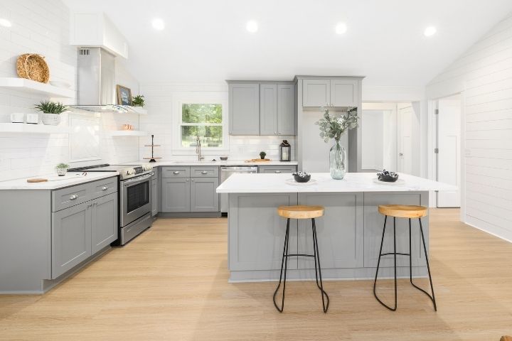
Homeowners could picture contrasting kitchen cabinet colors more easily when the bolder finish stayed on one defined feature. The contained contrast could ground a pale countertop, interrupt broad runs of matching cabinetry, and establish the kitchen island as the signature centerpiece of two-tone design.
Open-Plan Living Gave Contrast an Architectural Job
As walls between kitchens, dining rooms, and living spaces disappeared, cabinetry became visible from farther away and across several sightlines. In an open plan, kitchen cabinet colors could mark where food preparation and storage began without adding a partition. Contrast gained an architectural purpose by defining the kitchen while keeping the larger room visually connected.
A deeper tone across lower cabinets can settle the working side of the room, while lighter uppers prevent the cabinetry from feeling top-heavy. Small repetitions, such as a warm metal finish or a soft neutral drawn from the adjoining area, keep the boundary from looking abrupt. Together, those choices keep the kitchen recognizable from adjoining areas while preserving the openness of the shared interior.
Two Kitchen Cabinet Colors Need a Visual Relationship
Selecting two kitchen cabinet colors is only the beginning. Placement, undertone, and surrounding materials determine whether the combination feels cohesive from every sightline. Three relationships determine whether the colors still feel connected once they cover full cabinet runs.
Shared Undertones Keep the Pairing Connected
Contrasting finishes often need one shared quality, such as a warm undertone or similarly muted intensity. A creamy off-white can sit comfortably beside olive or warm stained oak because the related undertones give the eye a common thread.
Clear Contrast Makes the Division Look Deliberate
Related undertones can still look accidental when the finishes are nearly identical in lightness. A pale perimeter beside a medium or deep accent creates a clearer division across the room and under changing light.
Counters and Hardware Carry Color Across the Room
Countertop veining, backsplash tile, and hardware can echo subtle notes from both cabinet finishes. Repeating those notes across separate surfaces connects the color division with the rest of the kitchen.
Two-Tone Cabinets Escaped the Limits of a Single Style
Two-tone cabinetry crossed style categories because it adapted to different door profiles and materials. Shaker doors support warm traditional pairings, flat-panel fronts combine paint with straight-grain wood, and inset cabinetry can use contrast to distinguish a hutch or pantry.
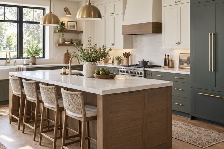
Door style, scale, and daylight all influence how kitchen cabinet colors behave. A narrow tonal shift emphasizes craftsmanship and texture, while stronger separation gives distinct cabinet groups greater presence.
Kitchen Cabinet Colors Make Two-Tone Design Feel Personal
Two-tone cabinetry became a defining feature because it gave homeowners more control over where color appeared and how strongly it shaped the room. The idea could shift from a quiet material change to a pronounced color division, which helped it outlast any one fashionable pairing. A personal result emerges when kitchen cabinet colors respond to daylight, fixed surfaces, and the atmosphere homeowners want to create.
Cabinet samples reveal more when you view them beside the countertops, flooring, and actual light in your own kitchen. Kitchen & Bathroom Transformations helps Northern California homeowners spot undertone conflicts and understand how each finish will behave across a full cabinet run. Build your two-tone palette with the design specialists before placing orders for doors, hardware, and coordinating surfaces.


