

The Psychology of Color in Kitchen and Bathroom Design
Color does more than shape how a room looks. It also influences how the space feels in daily use. In both kitchens and bathrooms, the right palette can make a room feel brighter, calmer, warmer, cleaner, or more refined. That is why color plays such an important role in kitchen and bathroom design. A well-chosen palette supports the room's style while also shaping comfort, mood, and everyday function.
How Color Influences Mood in Kitchen and Bathroom Design
Color has a direct effect on how a space feels. Soft whites, warm beiges, and muted grays often create a sense of calm and cleanliness. Blues and greens can make a bathroom feel more relaxing, while warmer tones can make a kitchen feel more inviting and active.
That difference matters because kitchens and bathrooms support different routines. Kitchens are usually more active and social, so color often works best when it adds warmth and energy. Bathrooms are more closely tied to comfort and routine, so color often works best when it feels quiet, clean, and easy to live with.
Choosing the Right Color Palette for Kitchen and Bathroom Design
Once you know how you want the room to feel, the next step is to choose a palette that supports the way the space is used. Warm tones like cream, taupe, and soft greige can make a room feel welcoming. Cooler tones like white, gray, blue, or sage often create a cleaner, more relaxed look.
Light and dark palettes also change how a room reads. Lighter colors can make kitchens and bathrooms feel more open and brighter. Darker tones can add contrast and depth, but they usually work best when balanced with enough light and the right materials.
It also helps to match the palette to your lifestyle and home style. A busy household may prefer colors that feel flexible and are visually easy to maintain, while a more design-focused space may benefit from stronger contrast or a more defined finish direction. Reviewing available color options can help narrow down combinations that fit both the home and its use.

How Light Affects Color in Kitchen and Bathroom Design
Light has a major effect on how color is perceived. In kitchen and bathroom design, the same surface can look warmer, cooler, brighter, or softer depending on the surrounding lighting. That is why a color that works in one room may feel different in another.
Natural light usually shows the truest version of a color, but it still shifts throughout the day. Morning light can make a surface feel cooler and brighter, while late afternoon light can add warmth. Artificial lighting changes color differently. Softer bulbs can warm up whites and neutrals, while cooler lighting can make some tones feel sharper or more clinical.
Surface placement matters too. Countertops, walls, and cabinetry catch light differently based on angle, finish, and position. A color that looks balanced on a wall may feel heavier on cabinetry or brighter across a large countertop surface. That is why it helps to consider the room’s lighting and layout before choosing finishes.
Using Neutral Colors to Create a Timeless Kitchen and Bathroom Design
Neutrals remain popular in kitchen and bathroom design because they create a clean, flexible foundation. Shades like white, cream, beige, greige, and soft gray tend to feel calm, polished, and easy to live with over time. They also work across a wide range of home styles, from classic interiors to more modern spaces.
Another advantage is flexibility. Neutral surfaces make it easier to update hardware, wall color, décor, or accent materials later without starting over. That can be especially useful for homeowners who want a space that feels current now while still leaving room for future updates.
Neutrals also work well with texture and finish variation. A soft matte surface, subtle pattern, or warmer undertone can add depth without losing a timeless look. That balance helps a room feel finished without feeling overdone.

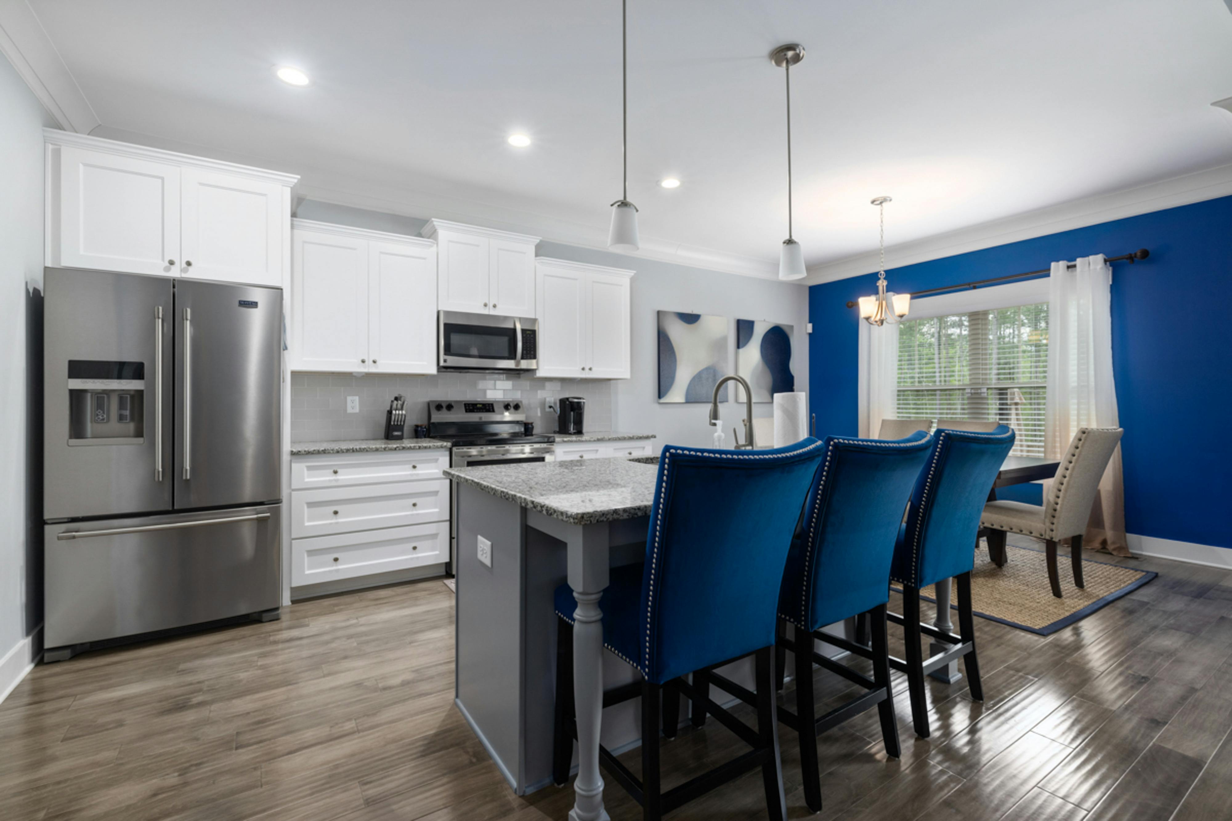
When to Use Bold Colors in Kitchen and Bathroom Design
Bold colors can add personality, but they work best when used with intention. In kitchen and bathroom design, strong colors are often most effective when focused on one area rather than spread across the entire room.
That could mean a kitchen island, a bathroom vanity, or a single accent wall. These areas naturally draw attention, so a deeper or more saturated color can create contrast without overwhelming the space. It also gives the rest of the room more balance.
To keep bold colors from feeling too heavy, it helps to anchor them with neutral elements. Pairing a darker cabinet or vanity with lighter surrounding surfaces can create contrast while keeping the overall look clean. The goal is not to make every part of the room stand out. It is to create one clear focal point while keeping the rest of the design grounded.
Balancing Color and Materials in Kitchen and Bathroom Design
Color works best when it is coordinated with the materials around it. In kitchen and bathroom design, that means thinking about how countertops, cabinets, walls, and fixtures work together rather than as separate choices.
Countertops often serve as a visual anchor because they cover a large surface area. Quartz, in particular, can help tie a space together with consistent color, subtle patterning, and flexible finish options. That makes it easier to connect cabinetry, wall color, and surrounding details without visual conflict.
The goal is a cohesive look that feels balanced and easy to live with. When color and materials support each other, the room feels more complete and more comfortable to use every day. When you are ready to bring your design together, contact Kitchen & Bathroom Transformations for a personalized quote.

