


The Most Popular Quartz Countertop Colors in American Kitchens Right Now
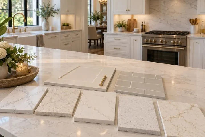
A row of quartz samples labeled white can contain cream undertones, smoky veins, warm gold movement, and crisp gray detail. Place those same samples beside oak cabinets or under cool LED light, and their differences become much harder to miss. Today’s most popular quartz countertop colors reflect a shift toward surfaces that feel bright without seeming flat or overly stark.
White and off-white still anchor American kitchens, while marble-inspired veining, warm neutrals, earthy blends, and selective dark tones are widening the field. Each color family changes how the counter relates to cabinetry, flooring, hardware, and daylight. Viewing each option in context helps you identify a current direction that can refresh the room as a whole.
What Is Shaping Today’s Quartz Palette?
Warmer cabinetry, visible wood grain, and connected living areas have changed what homeowners expect from a countertop. Current quartz countertop colors answer those conditions through softened backgrounds, natural-looking veins, and undertones that bridge paint, wood, metal, and flooring. The result is a wider neutral range, from nearly solid white to mineral-rich patterns with stronger movement and contrast.
White and Off-White Remain America's Leading Quartz Countertop Colors
These pale surfaces give the kitchen a light foundation and leave room for cabinetry, tile, and hardware to carry stronger tones. Yet the category now reaches beyond flat, paper-white slabs. Popular quartz countertop colors include milky bases, faint gray clouds, and creamy backgrounds that soften the transition between the counter and nearby materials.
A cooler white can sharpen navy or charcoal cabinetry, while a warmer off-white settles naturally beside oak, walnut, beige tile, or brass accents. The background deserves attention even when the veining captures your eye because a slight yellow, blue, or gray cast becomes more visible across a long counter. Comparing that base tone with fixed finishes prevents a pale surface from appearing unexpectedly cold or dingy after installation.
Marble-Look Veining Changes How Quartz Countertop Colors Read
A pale background can look restrained with fine gray lines or dramatic when taupe, charcoal, or gold veins sweep across it. Narrow veining creates quieter movement among current quartz countertop colors. Broad Calacatta-style patterns give an island or long counter run a stronger presence.
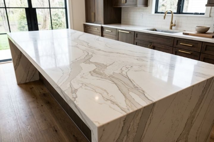
Pattern scale should relate to the available surface area and the room's other details. High-contrast veins can become the focal point. Softer movement sits more comfortably beside a patterned backsplash or prominent wood grain.
Beige, Greige, and Mushroom Make Warmth Look Modern
Warm neutrals have returned in more nuanced forms than the yellow-beige countertops common in earlier kitchens. Beige now leans sandy or creamy, greige balances brown and gray, and mushroom adds enough depth to define pale cabinetry without a sharp divide.
Across a broad island or long perimeter, these quartz countertop colors add depth without the heaviness of charcoal or black. Their muted warmth gives pale cabinetry more definition and creates a smoother transition to tan or brown flooring.
A greige label cannot reveal every undertone because the surface may show violet or green beside a cabinet door as daylight changes. Violet undertones can cool creamy finishes, and green undertones may become more noticeable near red-toned wood or terracotta flooring.
Earthier Quartz Countertop Colors Move Beyond Plain Neutrals
Some organic looks layer sand, clay, bark, mineral gray, or muted green through the surface instead of relying on one even background. These earthier quartz countertop colors add depth through mineral-like variation that recalls weathered wood, natural stone, or muted landscape colors.
Because each pattern carries several tones, it can repeat hues already present in cabinetry, flooring, or nearby finishes. A quiet backsplash or simple cabinet profile keeps the counter's layered detail easy to see.
Dark Quartz Holds a Smaller, Bolder Share
Although charcoal and black surfaces represent a smaller share of current choices, they can give an island, beverage station, or compact run a strong visual identity. Dark quartz countertop colors connect pale cabinetry with black window frames, appliances, or hardware. Subtle veining keeps the darker surface from looking heavy.
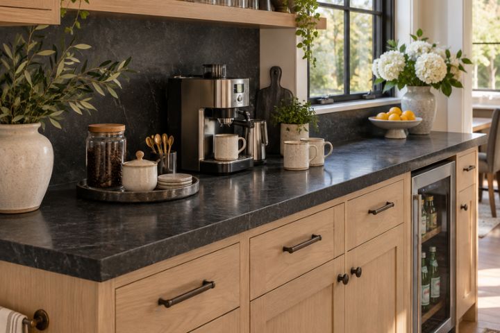
Daylight, room size, and surface area determine whether a dark counter feels dramatic or overpowering. Some polished black finishes reveal dust, fingerprints, and dried water spots more readily than mottled patterns, so finish and placement deserve as much attention as the color itself.
Test Quartz Countertop Colors Beyond the Sample Chip
Small chips help with an initial edit, although they hide the scale of veining and the way an undertone spreads across a long surface. Test quartz countertop colors beside the kitchen's fixed elements and under the light they will receive throughout the day. Four checks make the comparison more useful.
View the largest available sample in morning, afternoon, and evening light.
Stand several feet away to judge whether the vein scale suits the counter run.
Check the background against cabinets and flooring instead of a white showroom wall.
Pair it with the planned backsplash and hardware to catch competing undertones.
Photographs can help you remember each combination, especially when several pale options start to blur together. The final choice should still look connected to the room once the showroom display and sample name are out of view.
Let Your Kitchen Edit the Trend
Trend reports narrow the field, yet a popular color still has to suit the amount and shape of counter in one particular room. Quartz countertop colors look different across a compact perimeter, a long galley run, or a broad island because pattern scale and edge exposure change their impact. The full layout reveals whether a popular pattern adds definition or competes with the rest of the kitchen.
Kitchen & Bathroom Transformations offers marble-look, classic, and nature-inspired quartz options for Northern California kitchens. The design specialists can rule out patterns that appear balanced on a chip yet feel too busy or too quiet across the full counter. Bring your quartz shortlist to the team so the final selection suits the counter dimensions and balances the movement and contrast already present in the room.


