

How to Match Countertops and Floors Without Overdoing It
Choosing finishes for your kitchen or bathroom can feel overwhelming when trying to match countertops and floors. Coordinating surfaces carefully ensures the room looks balanced without feeling heavy or overly uniform. Thoughtful planning of tones, textures, and materials produces a polished, stylish appearance while maintaining practical function.
Many homeowners worry that matching everything will make spaces appear flat or overly coordinated. Subtle contrasts allow each surface to stand out while maintaining harmony between floors, countertops, and cabinetry. Using a thoughtful approach ensures both aesthetic appeal and long-term satisfaction for everyday living.
Can You Match Countertops and Floors Without Overdoing It?
Yes, matching countertops and floors is achievable without creating a heavy or monotonous look. Focusing on complementary tones, textures, and undertones allows surfaces to feel connected naturally. Testing samples in your home ensures confident choices and a cohesive overall design.
How Do Complementary Tones Help Match Countertops and Floors?
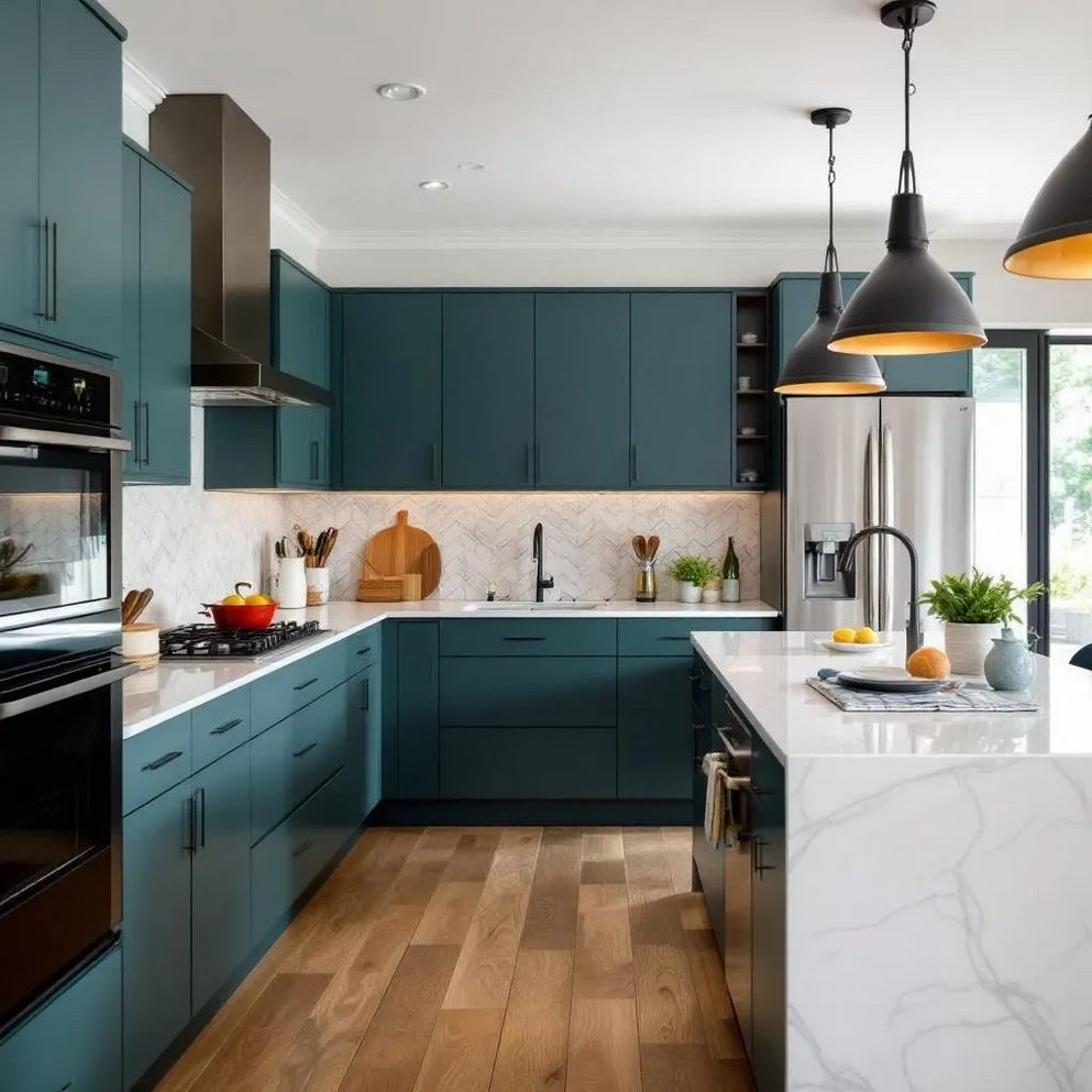
Complementary tones create a cohesive look without overwhelming the eye or causing visual tension. Choosing colors that share similar warmth or coolness helps countertops and floors feel naturally connected. This subtle coordination prevents spaces from appearing flat while enhancing overall design harmony.
Warm flooring complements countertops with beige, cream, or soft gold undertones, creating a naturally inviting atmosphere. Cool-toned floors pair beautifully with white, gray, or lightly veined quartz surfaces to maintain visual balance. Using complementary tones allows you to match countertops and floors without overdoing the effect.

Neutral surfaces offer flexibility for future updates or decor changes, blending seamlessly with new cabinetry or wall colors. Coordinated undertones ensure that flooring, countertops, and cabinets feel unified without appearing forced. You can explore complementary colors to enhance harmony across surfaces.
Finally, always review samples in natural light to understand how colors interact with the room’s surroundings. Different lighting conditions can change the perception of tones and textures dramatically. Evaluating finishes carefully ensures a harmonious, balanced space.
Why Should You Use Subtle Contrast?
Subtle contrast prevents spaces from feeling monotonous while keeping surfaces visually harmonious. Avoid using identical colors or patterns, which can flatten the room’s overall appearance. Slight differences in shade, value, or finish allow individual surfaces to stand out naturally.
Pairing medium-toned flooring with lighter countertops helps define surfaces clearly while maintaining cohesion. Darker countertops can anchor a space, providing depth and visual interest without overwhelming the overall design. These small variations highlight individual surfaces while preserving harmony.
Consider these approaches to maintain subtle contrast when matching countertops and floors:
Shift the value: Use lighter or darker shades within the same color family.
Limit patterns: Flooring with patterns works best with subtler countertop designs.
Balance large surfaces: Pair light countertops with darker floors for a clear distinction.
Accent strategically: Hardware and fixtures echoing countertop tones enhance visual connection.
Observe in natural light: Lighting reveals how surfaces appear together throughout the day.
Applying subtle contrast ensures spaces feel intentionally designed without appearing heavy or overmatched. This technique makes floors and countertops feel coordinated yet visually dynamic.
How Can Texture Variation Improve Coordination?
Texture adds depth, preventing floors and countertops from blending into a monotonous background. Coordinating surfaces requires attention to how they feel visually, not just their color. Combining different finishes introduces interest while supporting functional use.
Matte flooring paired with polished quartz countertops creates a subtle contrast without clashing. Light reflection differences highlight surfaces naturally while enhancing the overall aesthetic of your kitchen or bathroom. Texture variation improves coordination between countertops and floors while keeping the space lively.
Surface finishes impact durability and ease of maintenance, which is important for everyday living. Selecting materials that withstand frequent use ensures long-term satisfaction and practical benefits. Learn more about choosing finishes for durable quartz surfaces.
Quartz countertops also support busy households with high-traffic areas, resisting scratches and stains effectively. For additional guidance, check kitchen countertops to ensure functional and stylish coordination. Thoughtful selection allows you to match countertops and floors confidently.
How Do Coordinated Undertones Create Harmony?
Undertones help connect cabinets, walls, floors, and countertops for a cohesive look. Even subtle hints of warmth or coolness create visual alignment across surfaces. Coordinated undertones prevent spaces from feeling disjointed while enhancing overall style.
Review samples in your space to see how undertones interact with cabinetry and walls. Matching hints of color across surfaces naturally links elements together without forcing uniformity. Using this method ensures countertops and floors complement the room’s design.
Consider these steps for successful undertone coordination:
Compare samples side by side to evaluate how colors interact naturally.
Observe finishes in both morning and evening light to note variations.
Include hardware and fixtures to complement surface undertones effectively.
Test finishes together for consistent matte, glossy, or textured results.
Step back to assess overall cohesion from a distance in your space.
Thoughtful undertone coordination helps match countertops and floors while creating a refined, polished appearance. It connects all surfaces intentionally without overwhelming the room. For inspiration, check refresh bathroom vanity ideas.
How Can Testing Samples Ensure Confident Choices?
Testing samples in your home prevents unexpected results from showroom lighting differences. Placing samples together allows you to evaluate color, pattern, and texture interactions accurately. Testing ensures decisions feel intentional and visually cohesive.
Observe samples under both natural and artificial light to understand how surfaces appear. Countertops and floors can look different depending on the time of day and the light source. This process allows you to match countertops and floors confidently and practically.

Evaluate finishes with daily activities in mind, considering durability, maintenance, and family usage. Insights from quartz surfaces for busy households guide practical decision-making. Thoughtful testing prevents costly mistakes and ensures surfaces function well.
Finally, step back and assess the space as a whole to confirm balance and harmony. Seeing everything together reinforces confidence in your selections. Proper testing ensures a cohesive and intentional result.
Creating a Balanced and Intentional Look
Matching countertops and floors carefully results in a polished and comfortable space. Complementary tones, subtle contrast, texture variation, and coordinated undertones all work together. Thoughtful testing ensures every surface feels intentional rather than randomly chosen.
Matching countertops and floors enhances both style and practical function for everyday use. Kitchen & Bathroom Transformations helps homeowners select engineered quartz finishes that complement flooring and cabinetry without overwhelming the space. For a refined, low-stress update, you can book a consultation now to explore options tailored to your home.

